Today's Posts Follow Us On Twitter! TFL Members on Twitter  
Forum search: Advanced Search  
Navigation
Marketplace
  Members Login:
Lost password?
  Forum Statistics:
Forum Members: 24,254
Total Threads: 80,792
Total Posts: 566,471
There are 1326 users currently browsing (tf).
 
  Our Partners:
 
  TalkFreelance     Design and Development     Graphic Design, Multimedia and Photography     The Gallery Showcase :

New Logo

Thread title: New Logo
Reply    
    Thread tools Search this thread Display Modes  
06-23-2011, 03:43 AM
#1
BUrgy is offline BUrgy
Status: I love this place
Join date: Feb 2007
Location: under your bed
Expertise:
Software:
 
Posts: 589
iTrader: 2 / 100%
 

BUrgy is on a distinguished road

Send a message via AIM to BUrgy Send a message via MSN to BUrgy

  Old  New Logo

Hey, due to college and other things I haven't really designed anything in about 4 years, was kind of bored recently and decided to make a logo C@C would be appreciated.


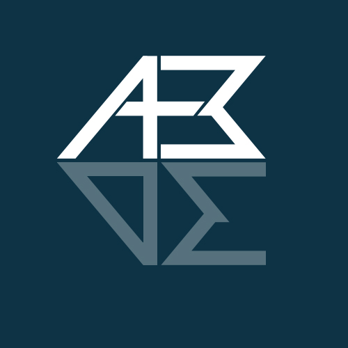
ABDE Stands for Alexander Burgazzoli Design, This is the first mock up of the logo, Tried kinda of a reflection style by reversing the "B" for the "E" and a similar style for the "A" and "D". Also lowered the opacity for the "DE" making the "AB" Stand out more. Again this is the first concept not completely done yet.

06-23-2011, 07:08 AM
#2
jasondk is offline jasondk
Status: I'm new around here
Join date: Jun 2011
Location: New York
Expertise:
Software:
 
Posts: 18
iTrader: 0 / 0%
 

jasondk is on a distinguished road

  Old

Yeah,I like the color.

This is the first mock up of the logo, Tried kinda of a reflection style by reversing the "B" for the "E" and a similar style for the "A" and "D". Also lowered the opacity for the "DE" making the "AB" Stand out more. Again this is the first concept not completely done yet.
Design ideas are quite OK.Come on!

Reply With Quote
06-24-2011, 11:00 PM
#3
LeBigBang is offline LeBigBang
Status: Member
Join date: Apr 2007
Location:
Expertise:
Software:
 
Posts: 202
iTrader: 0 / 0%
 

LeBigBang is on a distinguished road

Send a message via AIM to LeBigBang Send a message via MSN to LeBigBang

  Old

I really didn't think it was a "D" before reading your post. But looks cool so far

Reply With Quote
06-27-2011, 03:33 PM
#4
derek lapp is offline derek lapp
Status: design rockstar
Join date: Jan 2005
Location: guelph, ontario
Expertise:
Software:
 
Posts: 2,246
iTrader: 0 / 0%
 

derek lapp is on a distinguished road

  Old

i think it could work. my initial reaction to it was that it would be awkward to use, but i'm really warming up to it now. i'm also in agreeance that the D needs to be shaped more like a D. i get the symmetry part with the D, and i wouldn't change it drastically, but i think if you messed with the knockout piece it may be a bit more obvious.

Reply With Quote
07-04-2011, 09:09 PM
#5
BUrgy is offline BUrgy
Status: I love this place
Join date: Feb 2007
Location: under your bed
Expertise:
Software:
 
Posts: 589
iTrader: 2 / 100%
 

BUrgy is on a distinguished road

Send a message via AIM to BUrgy Send a message via MSN to BUrgy

  Old

Thanks guys, I'll definitely take some advice you guys gave and probably have a re-designed logo to show in a week or so

Reply With Quote
08-12-2011, 11:23 PM
#6
dlopez916 is offline dlopez916
dlopez916's Avatar
Status: Member
Join date: Oct 2009
Location: Russellville, AR
Expertise: CSS, HTML, Flash, Photoshop
Software: Photoshop, Dreamweaver, Frefox
 
Posts: 108
iTrader: 0 / 0%
 

dlopez916 is on a distinguished road

  Old

I think it looks pretty good. The D isn't correctly shaped, but when you realize it's a D. it looks proper. Nice Work.

Reply With Quote
02-29-2012, 03:53 PM
#7
printchesco is offline printchesco
Status: I'm new around here
Join date: Feb 2012
Location:
Expertise:
Software:
 
Posts: 19
iTrader: 0 / 0%
 

printchesco is on a distinguished road

  Old

It's true, the D is a bit of a stretch, but overall the design looks pretty good actually. The color and the way you used opacity is fine the way they are, but you can also try experimenting not only on the letters but also on the spaces between them. The logo is good, but a little tweaking will surely make it that much better.

Reply With Quote
Reply    


Currently Active Users Viewing This Thread: 1 (0 members and 1 guests)
 
Thread Tools
Display Modes

  Posting Rules  
Smilies are On
[IMG] code is On
HTML code is Off
Forum Jump:
 
  Contains New Posts Forum Contains New Posts   Contains No New Posts Forum Contains No New Posts   A Closed Forum Forum is Closed