Today's Posts Follow Us On Twitter! TFL Members on Twitter  
Forum search: Advanced Search  
Navigation
Marketplace
  Members Login:
Lost password?
  Forum Statistics:
Forum Members: 24,254
Total Threads: 80,792
Total Posts: 566,471
There are 587 users currently browsing (tf).
 
  Our Partners:
 
  TalkFreelance     Marketplace     Services Offered / Looking to Hire     Graphic or Web Design :

→ [EASY] $20 Logo Design Contest - L@@K

Thread title: → [EASY] $20 Logo Design Contest - L@@K
Closed Thread  
Page 1 of 7 1 2 3 4 5 >
    Thread tools Search this thread Display Modes  
03-25-2008, 02:55 AM
#1
GM-EGS is offline GM-EGS
GM-EGS's Avatar
Status: I love this place
Join date: Jan 2005
Location: New Jersey
Expertise:
Software:
 
Posts: 508
iTrader: 8 / 100%
 

GM-EGS is on a distinguished road

  Old  → [EASY] $20 Logo Design Contest - L@@K

Hello great Talk Freelance designers!

I am holding another logo design contest, but this time, it's super-easy!

Design Contest End Date: 03/27/2008
Design Contest Reward: $20 via PayPal
Design Contest Requirements: Design entries submitted must be watermarked GIF images. Participants may NOT link to images/external sites hosting the image - display images/entries directly within this thread. The winning designer MUST provide BOTH the PSD and GIF files after payment is issued - please ensure that there are no watermarks.

About My Design Contest:
Greetings.

I am now hosting a logo design contest for my flash games site.

I need the logo to blend in yet stick out of the current site header's background; I want people to notice and remember the site's name through the logo that you create.

Be unique and be creative. This can be an EASY $20 for you.

HINT: Perhaps incorporating popular game images, such as PacMan or Mario, into your logo design entry will increase your chances of winning this logo design contest?

I want the name of the site to stand out. The best way I can explain the effect I want is for YOU to whisper the site name out-loud (GameLized) - that's the effect that I want people to interpret when reading the logo on the site, so make sure it stands out to give that effect!

Site Name: GameLized
Slogan (OPTIONAL): Free Online Games


I look forward to seeing the entries submitted within this contest thread.

Good luck to you!

03-25-2008, 03:39 AM
#2
Michael C is offline Michael C
Michael C's Avatar
Status: Senior Member
Join date: Jul 2006
Location: Scotland, East Lothian
Expertise:
Software:
 
Posts: 888
iTrader: 4 / 100%
 

Michael C is on a distinguished road

Send a message via MSN to Michael C

  Old

I added my logo onto the website design. Let me know what you think: Post for high quality preview.

03-25-2008, 09:42 AM
#3
kail is offline kail
Status: I'm new around here
Join date: Mar 2008
Location:
Expertise:
Software:
 
Posts: 12
iTrader: 0 / 0%
 

kail is on a distinguished road

  Old


I had to add it to the background like that as transparency didnt turn out so well when saving as gif.

And i drew the ghost by hand :P

Revised

03-25-2008, 12:34 PM
#4
Pixale is offline Pixale
Status: Member
Join date: May 2007
Location:
Expertise:
Software:
 
Posts: 252
iTrader: 6 / 100%
 

Pixale is on a distinguished road

Send a message via MSN to Pixale

  Old

Hey man


Used the blue from the dancers and white from the patterns to make this suit and match the header. Added some glow and blur effects to make it stand out and have the "wow" factor.

Changes can be made.

Regards,
Ste

03-25-2008, 01:12 PM
#5
xaralee is offline xaralee
Status: Junior Member
Join date: Mar 2008
Location: Java Island -Indonesia-
Expertise:
Software:
 
Posts: 53
iTrader: 1 / 100%
 

xaralee is on a distinguished road

  Old

My entry :


Feedback appreciated.
Thank you.

03-25-2008, 02:18 PM
#6
Rybo is offline Rybo
Status: Junior Member
Join date: Dec 2007
Location:
Expertise:
Software:
 
Posts: 25
iTrader: 0 / 0%
 

Rybo is on a distinguished road

  Old

surley people cant be using mario!! as king would have a law suit on his hands

HERE IS MY ENTRY - Extremely Orginal

03-25-2008, 03:50 PM
#7
TributeK is offline TributeK
Status: I'm new around here
Join date: Mar 2008
Location:
Expertise:
Software:
 
Posts: 17
iTrader: 0 / 0%
 

TributeK is on a distinguished road

  Old  My entry

This isn't complete yet, unfortunately I ran out of time before work. I still need to add the horizontal menu to it. Tell me what you think.

03-25-2008, 04:05 PM
#8
Seolust is offline Seolust
Status: Junior Member
Join date: Feb 2008
Location:
Expertise:
Software:
 
Posts: 84
iTrader: 5 / 100%
 

Seolust is on a distinguished road

  Old


The icon is free

03-25-2008, 04:32 PM
#9
RossJJ is offline RossJJ
Status: RJ
Join date: Dec 2004
Location: Essex
Expertise:
Software:
 
Posts: 1,116
iTrader: 1 / 100%
 

RossJJ is on a distinguished road

Send a message via AIM to RossJJ Send a message via MSN to RossJJ

  Old

Originally Posted by xaralee View Post
My entry :


Feedback appreciated.
Thank you.
That looks awesome

03-25-2008, 05:50 PM
#10
GM-EGS is offline GM-EGS
GM-EGS's Avatar
Status: I love this place
Join date: Jan 2005
Location: New Jersey
Expertise:
Software:
 
Posts: 508
iTrader: 8 / 100%
 

GM-EGS is on a distinguished road

  Old

Wow! Great entries [as usual] so far! Keep them coming!

I will be trying to give some constructive feedback to as many as you as I possibly can so that you guys will all have an equal-shot as becoming this contest's winner, so bear with me!

mikka23: Your entry was simple, WAY too simple! That doesn't look like a logo, but looks like some text with a drop-shadow and stroke effect next to a Mario image!
kail: I like your entry and your originality, but your hand-drawn ghost is just a bit too freaky for my tastes! Haha, keep the entries coming though.
Audigex: Your entry is really original, and I like it, but it just doesn't blend in/match my current header. It just wouldn't fit in.
xaralee: Your entry so far is one of my favorite in this contest! Good job, you really made the logo stick out by having Mario step out, which is exactly the effect that I want it to have on people! The fonts, though, are a bit weak...try browsing www.dafont.com for alternative font solutions?
Rybo: I love your entry, but, there's just something about it that makes it way too plain. Perhaps its the constant black-and-white color scheme going on, or maybe even the font used. I do like the pink in it though. Your entry is definitely one of the most original submitted yet though, and I like that.
TributeK: Another superb entry from you, good job! I totally like your entry, but I don't feel that the 3D Zelda/Link image is appropriate, perhaps a 2D one would be better? Also, is it low-quality on purpose? I really like your entry, it can be higher-quality though.
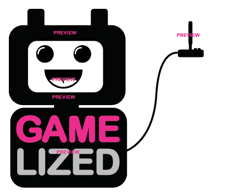
Seolust: I like your entry very much, but the font could definitely be changed to something better, something that stands out. Maybe even have the text "Game" one color and "Lized" another? I like your approach though, and the simplicity in it, and the joystick image. I also like how you have the slogan on top of the site name, which makes your entry unique as nobody else has done it so far.

Here are some fonts that I previewed with DaFont.com that I think may look good in the logo:
The choice of fonts is up to you. Be unique, be original, be creative.
I also do like the font TributeK used in his entry, though I do not know the name of the font.

Good luck to everyone! You guys are really talented; keep those entries coming!

This contest ends in TWO days time.

Closed Thread  
Page 1 of 7 1 2 3 4 5 >


Currently Active Users Viewing This Thread: 1 (0 members and 1 guests)
 
Thread Tools
Display Modes

  Posting Rules  
Smilies are On
[IMG] code is On
HTML code is Off
Forum Jump:
 
  Contains New Posts Forum Contains New Posts   Contains No New Posts Forum Contains No New Posts   A Closed Forum Forum is Closed