Today's Posts Follow Us On Twitter! TFL Members on Twitter  
Forum search: Advanced Search  
Navigation
Marketplace
  Members Login:
Lost password?
  Forum Statistics:
Forum Members: 24,254
Total Threads: 80,792
Total Posts: 566,472
There are 1455 users currently browsing (tf).
 
  Our Partners:
 
  TalkFreelance     Design and Development     Graphic Design, Multimedia and Photography     The Gallery Showcase :

New Gaming layout.

Thread title: New Gaming layout.
Reply    
    Thread tools Search this thread Display Modes  
02-07-2010, 12:43 AM
#1
Griffin is offline Griffin
Griffin's Avatar
Status: Junior Member
Join date: Oct 2005
Location:
Expertise:
Software:
 
Posts: 55
iTrader: 0 / 0%
 

Griffin is on a distinguished road

  Old  New Gaming layout.

Hey,

I've been working on a new gaming layout for the past week or so and would like to get some feedback on it.

here's the main page design:


and the splashpage I designed can be seen at:

www.unitedgamersociety.com

both are different styles, so any comments suggestions on eitherw ould be appreciated

- Griffin

Reply With Quote
02-25-2010, 06:12 PM
#2
Vanhel is offline Vanhel
Status: Junior Member
Join date: Feb 2010
Location:
Expertise:
Software:
 
Posts: 28
iTrader: 0 / 0%
 

Vanhel is on a distinguished road

  Old

Very nice one, creative

Reply With Quote
03-14-2010, 08:34 PM
#3
joshclements is offline joshclements
joshclements's Avatar
Status: I'm new around here
Join date: Feb 2010
Location:
Expertise:
Software:
 
Posts: 14
iTrader: 0 / 0%
 

joshclements is on a distinguished road

  Old

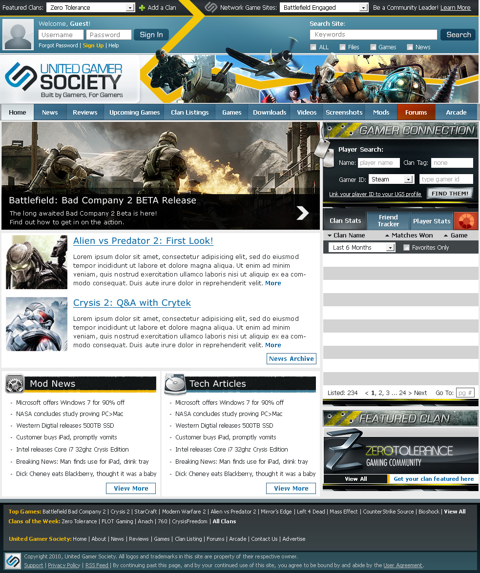
Some portions of the piece seem very well done while others seem cluttered.

Likes:
- I like the button work in and around the gamer connection area. You have nice use of contrast there and the whole thing has a polished look while still maintaining a user-friendly interface.
- You definitely pull off the gamer website style very well. It's not hard to tell what you're looking at when you first visit the page.

Dislikes:
- The top banner, while quite creative, seems a tad cluttered. There are some aspects that are nice like the wing of the plane overlapping another part of the page. However the yellow strip seems poorly done. I can't exactly put my finger on what it is but it needs some work.
- You need to try mimic some of the color/contrast work on the "Gamer Connection" buttons in the general navigation at the top of the page. The Orange/Red on the forums looks great but I think adding a larger difference in hue on the blue buttons would give it a good edge.

Reply With Quote
Reply    


Currently Active Users Viewing This Thread: 1 (0 members and 1 guests)
 

  Posting Rules  
Smilies are On
[IMG] code is On
HTML code is Off
Forum Jump:
 
  Contains New Posts Forum Contains New Posts   Contains No New Posts Forum Contains No New Posts   A Closed Forum Forum is Closed