|
 |
|
|
|
| Thread title: New Portfolio |
 |
|
|
| |
|
 Thread tools
 Search this thread
 Display Modes
|
|
|
12-26-2007, 10:01 PM
|
#1
|
Status: Member
Join date: Dec 2007
Location: Liverpool, UK
Expertise:
Software:
Posts: 287


|
 New Portfolio New Portfolio
|
|
|
|
12-27-2007, 12:58 AM
|
#2
|
Status: design rockstar
Join date: Jan 2005
Location: guelph, ontario
Expertise:
Software:
Posts: 2,246
|
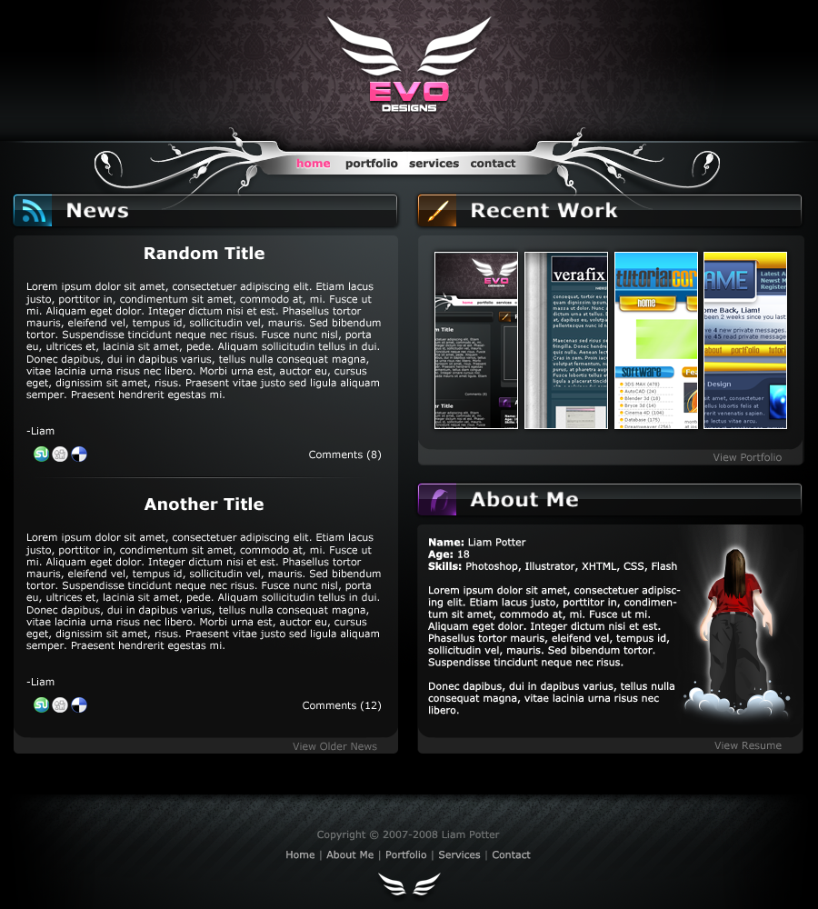
overall it's got great style, but i'm iff on a couple things and think they could be taken further:
- outer glows (logo) need to go. crisp edges are 100x better that blurred ones 90% of the time.
- ditch the drop shadow on the menu flairs. right now it doesn't make sense. it's a solid white, yet a gradual shadow suggests the edges are lifting off the page. the foreground and background don't match. either the white needs shading to reflect the light, or the shadow needs to go.
- the column widths should be the same width as the titles. the margin, imo, isn't necessary and throws the grid off.
- the line height is ridiculously tight. give that content some air!
- your margins are off. there should be consistent spacing between the columns, title-to-content-box and between the content and the edges of the header/footer.
it looks like you spent a lot of time working on the background and just slapped the body together. spend equal amounts of time on each element and you'll get far better results.
|
|
|
|
12-27-2007, 02:15 AM
|
#3
|
Status: Member
Join date: Dec 2007
Location: Liverpool, UK
Expertise:
Software:
Posts: 287
|
Thanks Derek,
I've edited some things and added lighting to the navigation.
|
|
|
|
12-27-2007, 03:05 AM
|
#4
|
Status: design rockstar
Join date: Jan 2005
Location: guelph, ontario
Expertise:
Software:
Posts: 2,246
|
i think that looks loads better. good job!
lighting on the nav seems a *little* strong by the text - specificlly the pink for the 2 end links. i was thinking about 75%-50% of what you did, but i think you nailed it otherwise.
|
|
|
|
12-27-2007, 10:47 PM
|
#5
|
Status: Member
Join date: Dec 2007
Location: Liverpool, UK
Expertise:
Software:
Posts: 287
|
I hate IE, just started coding and IE is already giving me headaches 
edit: human wins 
edit2: got the layout coded, now to create some content, fill in the gaps etc. then code a little backend, should be up in the new year 
|
|
|
|
12-30-2007, 10:08 PM
|
#6
|
Status: Junior Member
Join date: Dec 2007
Location: London, UK.
Expertise:
Software:
Posts: 45
|
Thats like the hottest template ever. I love the purple pattern, The logo and the colors. The rest are just sick. Where do you get those kind of patterns? I've been searching like hell..
|
|
|
|
12-30-2007, 10:18 PM
|
#7
|
Status: Junior Member
Join date: Dec 2007
Location:
Expertise:
Software:
Posts: 26
|
i have nothing bad to say, and too much good, nice job!!!
|
|
|
|
12-30-2007, 10:38 PM
|
#8
|
Status: Member
Join date: Nov 2007
Location: LakeDistrict, England
Expertise:
Software:
Posts: 279
|
@Evasion you can make them yourself or you can find them at Istockphoto.com
|
|
|
|
12-30-2007, 10:51 PM
|
#9
|
Status: Junior Member
Join date: Dec 2007
Location: London, UK.
Expertise:
Software:
Posts: 45
|
Well to be honest, I've never tried and there isn't good tutorials for those kind of patterns and thanks for that link mate, I'll check it out!
|
|
|
|
12-31-2007, 02:20 AM
|
#10
|
Status: Member
Join date: Jun 2007
Location: East Yorkshire, England
Expertise:
Software:
Posts: 112
|
Hey Liam. Really nice work here!
Great job on the improvements buddy. Derek pointed out some key things there and as he said, you pretty much nailed them in the update. So good job there!
I like what you did with the menu vector swirl thingies, hehe. The added shading/bevel gives them a nice metalic touch and compliments the drop shadow much better. More believable now that they are rising from the page
Anyway, I have one last suggestion, but it's only a matter of taste. I like your logo, but it rubs me the wrong way slightly being completely solid white, next to the new navigation. I think it would look good if you added even a faint gradient from white to light grey/silver, just to give it a bit of depth.
Good job all round mate. Looking forward to seeing the coded version! 
Peace, Lance
|
|
|
|
|
|
|
|
|
|
Currently Active Users Viewing This Thread: 1 (0 members and 1 guests)
|
|
|
|
|


 Linear Mode

 Forum Contains New Posts
  Forum Contains No New Posts
  Forum is Closed