|
 |
|
|
|
| Thread title: Marketplace Changes. |
 |
|
|
| |
|
 Thread tools
 Search this thread
 Display Modes
|
|
|
03-02-2007, 02:58 PM
|
#1
|
Status: Request a custom title
Join date: Dec 2005
Location:
Expertise:
Software:
Posts: 1,182

|
 Marketplace Changes. Marketplace Changes.
Hi,
To continue with our development of TF, I have just incorporated some new fucntionality which should greatly improve the usibility of the marketplace. You will find now that when you add a new thread to one of the forums you will have additional fields to complete. These are then visible to the users as they browse the forum.
This should enable much quicker finding and sorting of the products or services they want, and keep the whole thing a lot neater and userfriendly.
Thanks
|
|
|
|
03-02-2007, 03:16 PM
|
#2
|
Status: Member
Join date: Dec 2005
Location: Staffordshire, UK
Expertise:
Software:
Posts: 375

|
awesome 
|
|
|
|
03-02-2007, 03:16 PM
|
#3
|
Status: Community Archaeologist
Join date: Jul 2004
Location: Scotland
Expertise: Software Development
Software: vim, PHP
Posts: 3,820
|
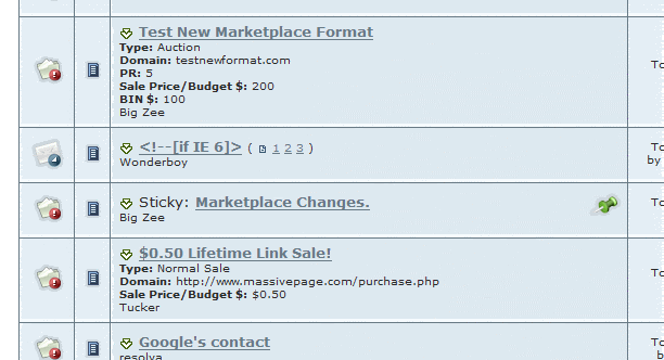
I'm all for changes and improvements but I really, really don't like this:
|
|
|
|
03-02-2007, 03:50 PM
|
#4
|
Status: Geek
Join date: Apr 2006
Location: Denver, CO
Expertise: Software
Software: Chrome, Notepad++
Posts: 6,894
|
I am full support of this, I think it makes the marketplace look better
|
|
|
|
03-02-2007, 04:00 PM
|
#5
|
Status: TFL Veteran
Join date: May 2005
Location: FL, USA
Expertise: Design
Software: Photoshop
Posts: 3,010
|
i like it except what salathe said but its not too bad.
|
|
|
|
03-02-2007, 04:32 PM
|
#6
|
Status: Request a custom title
Join date: Jan 2005
Location: West Sussex, England
Expertise:
Software:
Posts: 2,829
|
Its not too bad looking, its a nice touch - easier to navigate.
|
|
|
|
03-02-2007, 04:41 PM
|
#7
|
Status: Request a custom title
Join date: Nov 2004
Location: England
Expertise:
Software:
Posts: 3,515
|
The whole aesthetics side of it isn't a problem, it's just because this skin wasn't designed to handle things like this. When the new skin arrives it'll look much better don't forget
|
|
|
|
03-02-2007, 04:45 PM
|
#8
|
Status: Community Archaeologist
Join date: Jul 2004
Location: Scotland
Expertise: Software Development
Software: vim, PHP
Posts: 3,820
|
Thanks Bazza. I like the new functional changes to the market forums, hopefully it'll help to create a more structured feeling -- just the aesthetics letting the side down at the moment, creating an untidy feeling.
|
|
|
|
03-02-2007, 04:57 PM
|
#9
|
Status: Member
Join date: Dec 2005
Location: Canada
Expertise:
Software:
Posts: 194

|
|
|
|
|
03-02-2007, 05:33 PM
|
#10
|
Status: Request a custom title
Join date: Dec 2005
Location:
Expertise:
Software:
Posts: 1,182
|
Originally Posted by Salathe 
I'm all for changes and improvements but I really, really don't like this:
|
I think Salathes image hits the point right on the head - if you where a browser looking for websites to buy - which of the listings in the image provides something useful to a buyer?
It may not be totally asthetic, but we are talking about usability here - I know I for one would really appreciate the fact I am actually looking at something meaningfull and don't have to click into hundreds of different threads to find something of interest. I can quickly scan pages for something I am really interested in (and hopefully buy) - which is the whole point.
|
|
|
|
|
|
|
|
|
|
Currently Active Users Viewing This Thread: 1 (0 members and 1 guests)
|
|
|
|
|


 Linear Mode

 Forum Contains New Posts
  Forum Contains No New Posts
  Forum is Closed