Originally Posted by Salathe 
I'm all for changes and improvements but I really, really don't like this:
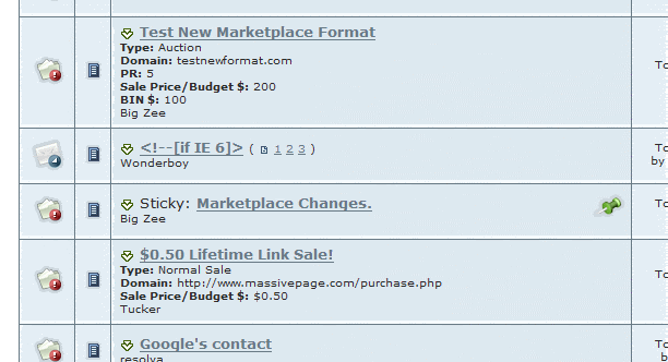 |
I think Salathes image hits the point right on the head - if you where a browser looking for websites to buy - which of the listings in the image provides something useful to a buyer?
It may not be totally asthetic, but we are talking about usability here - I know I for one would really appreciate the fact I am actually looking at something meaningfull and don't have to click into hundreds of different threads to find something of interest. I can quickly scan pages for something I am really interested in (and hopefully buy) - which is the whole point.